Scheduled Ordering System
Designed a restaurant scheduling system from zero — solving cross-role workflow failures and driving 53% adoption in the first month. Scaled to 16K+ restaurants and 2M+ customers.
Role
Senior Product Designer
Contribution
Led the strategy and design of a zero-to-one scheduling system across platforms. Drove cross-functional collaboration and mentored a junior designer.
Duration
6 weeks from research to design hand off
Company
iCHEF (Restaurant Tech/B2B2C SaaS)
PROBLEM
The system didn’t support scheduled orders, leading to manual workarounds, lost sales, and cross-role operational confusion
Restaurants needed to accept future orders, but the system only handled right now. Owners worked around this by asking customers to write pickup times in order notes — creating a chain of errors across every role: wrong orders, mismatched staffing, and inaccurate revenue reports.

COMPLEXITY
Designing across 4 roles, 3 platforms, and diverse restaurant business models without disrupting existing operations
This wasn't a single feature. Every design decision had to work for four different people at once, support diverse restaurant operating models, and fit into workflows restaurants already relied on — without disrupting daily operations under legacy constraints.

BUSINESS IMPACT
Achieved 53% adoption in the first month, driving 1%+ online revenue growth
Launched to 2,000+ restaurants, achieving 53% adoption in the first month and driving 1%+ online revenue growth. The solution later scaled to 16K+ restaurants, serving 2M+ customers. UX improvements increased daily activation by 71%, while cross-functional alignment reduced development time by two weeks.
Adoption (First Month)
+53%
Online Revenue (First Month)
+1%
PROBLEM FRAMING
Research across both sides of the system — restaurants and customers — to define what a reliable scheduling system needs to do
Restaurant Research & Insights (B2B)
Restaurants have diverse workflows, but share the same core need: fewer missed orders, less effort
Through 100+ feedback entries and 8+ interviews, I found that despite diverse workflows, restaurants share the same core need — fewer missed orders and less manual coordination. These directly translate to revenue growth, operational flexibility, and efficiency — which became the core design priorities.
💰
Prevent Missed Orders
Protect revenue from scheduling mistakes, off-hour loss
👥
Reduce Staff Workload
Less manual coordination and follow-ups
🍽️
Maintain Brand & Quality
Prepare orders at the right time
Customer Research & Insights (B2C)
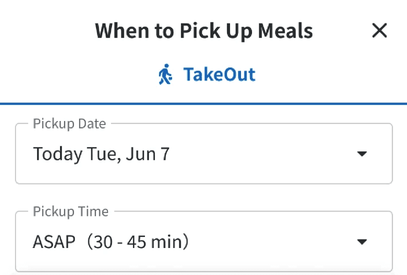
Customers want a clear and low-effort way to schedule orders and pick up on time
Through benchmarking 4 ordering platforms, I found that customers need clear availability upfront and predictable pickup time selection — without confusion, extra steps, and drop-off. This directly shaped how I designed the ordering flow: making scheduling visible, familiar, and frictionless.
Store Closed
Make scheduling availability visible upfront

Order Process
Make pickup time selection clear and predictable

DESIGN DECISION
Designing an end-to-end experience by making deliberate trade-offs across roles, platforms, and mental models

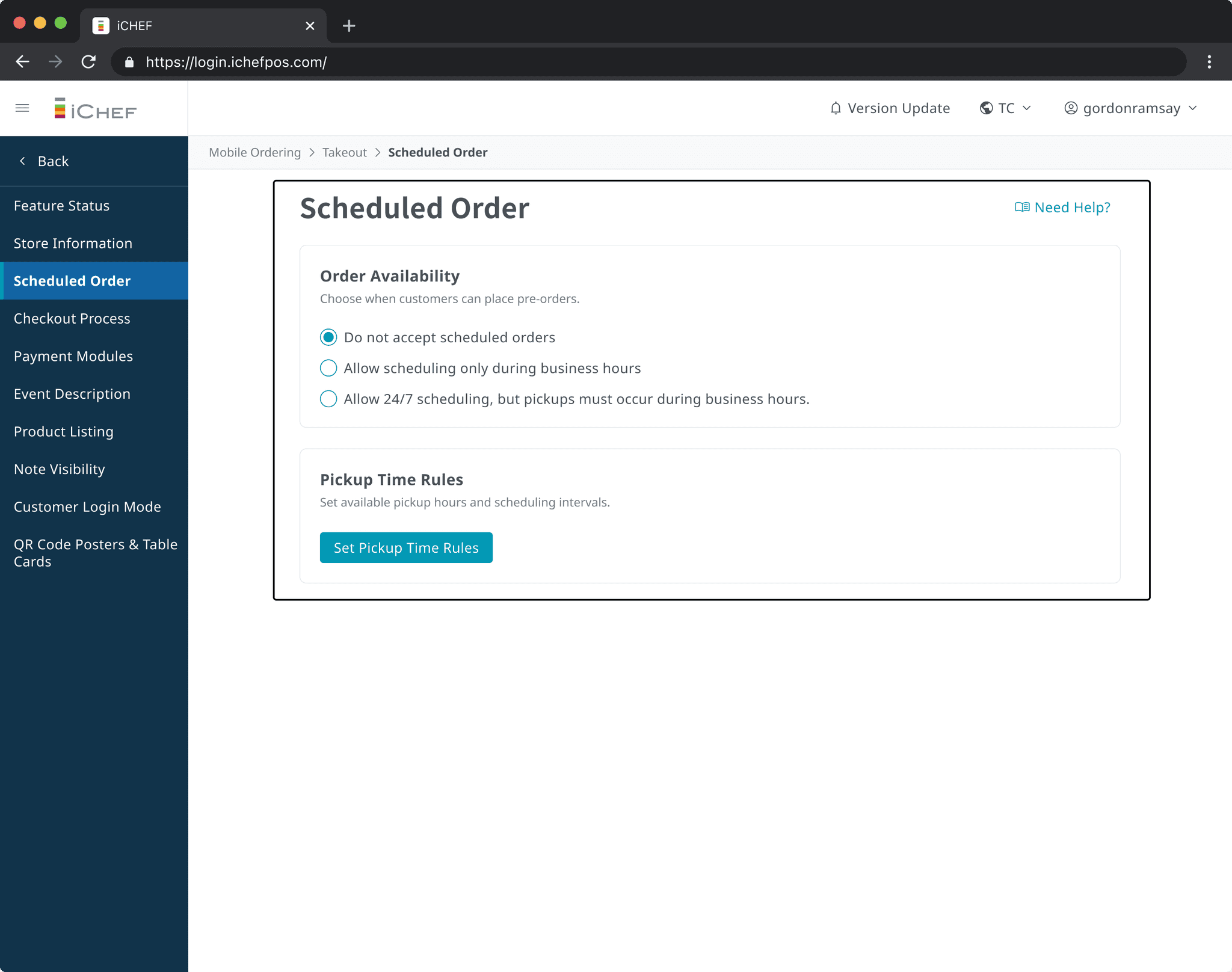
Merchant Platform for Restaurant Owners
Easy, flexible setup for diverse restaurant workflows
① One-click import Most restaurants schedule pickups within business hours. Rather than asking owners to re-enter existing data, I designed a one-click import that pulls in their current business hours directly — reducing setup friction and the risk of configuration errors.
② Navigation placement I initially placed the feature within the existing menu structure, but pilot testing showed owners couldn't find it. Moving it to a dedicated entry point drove 71% higher daily activation rate.
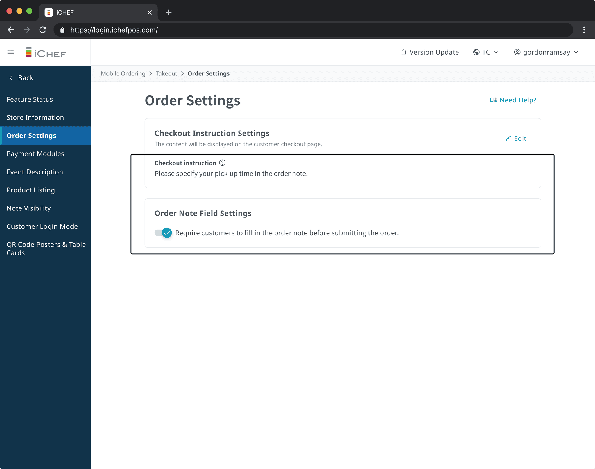


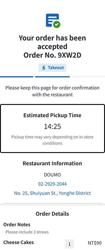
Online Ordering Website for Customers
A clear scheduling experience built on a single source of truth
Previously, restaurants asked customers to note pickup times manually, while the system generated a different time after checkout — causing errors and confusion. I unified pickup time into a single source of truth, enabling customers to choose between ASAP and scheduled pickup, with the selected time applied consistently across ordering, POS, and kitchen. I also replaced numeric dates with text-based dates to reduce formatting misunderstandings.


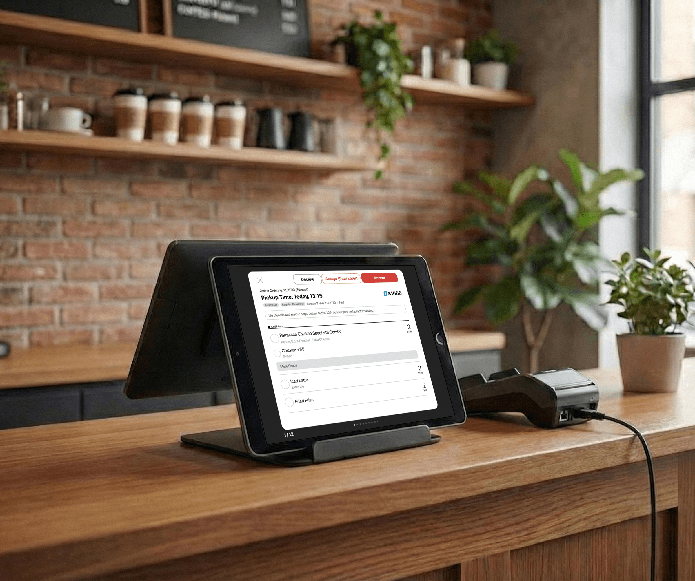
POS for Restaurant Staff
A minimal-disruption workflow for fast order management
① Workflow integration Restaurant staff rely on fast, familiar POS workflows. Early testing showed that large structural changes would slow down daily operations — so instead of redesigning the flow, I integrated scheduled orders into existing interaction patterns to minimize disruption.
② Print Later visibility Rather than hiding Print Later in settings, I made it visible and enabled by default for all restaurants. This maximized feature exposure across the board, while giving each restaurant the flexibility to configure it based on how their team actually works — supporting diverse restaurants without forcing a one-size-fits-all approach.


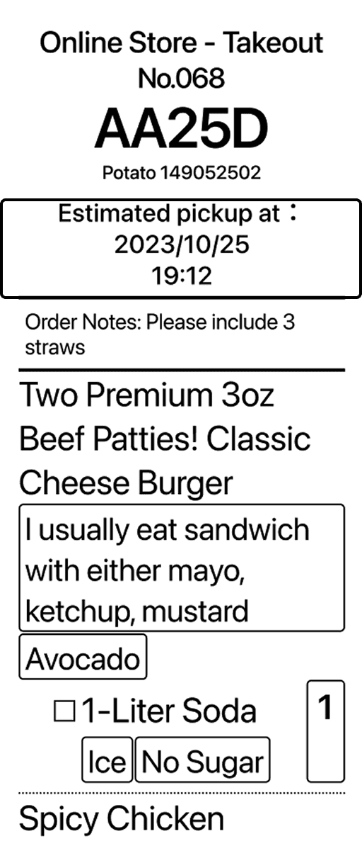
Order Prep Slip for Kitchen Staff
A single source of truth that eliminated conflicting pickup times
Previously, kitchen staff received order slips with two conflicting pickup times — one from the system, one from the customer's manual note. By establishing a unified scheduling system, the customer note became unnecessary, leaving only one system-defined pickup time on every slip. The kitchen problem solved itself.
Order Prep Slip for Kitchen
❌ Before
Conflicting pickup times from notes and system confused kitchen staff

✅ After
A single system-defined pickup time provides a clear source of truth for meal prep
SYSTEM DESIGN
Rebuilding the scheduling logic to eliminate conflicts across roles and platforms
Pickup Time Design
Defining pickup time rules to ensure clarity and a single source of truth
To prevent order confusion and lost sales, I rebuilt the pickup time logic across three key rules.
① Availability from pickup windows, not calendar dates — Prevents dates from appearing unavailable when restaurants are still accepting orders.
② ASAP is always the earliest valid option — Ensures customers never see a scheduled slot that appears sooner than ASAP.
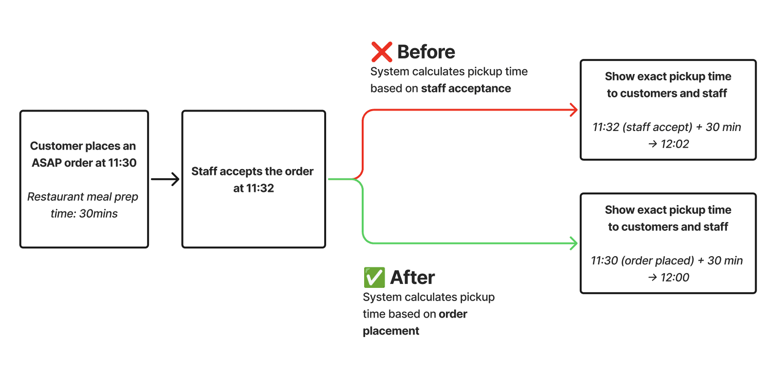
③ ASAP time calculated at order placement — Prevents ASAP from appearing later than scheduled options. 93% of orders accepted within one minute made the trade-off low risk.
① Availability from pickup windows, not calendar dates
② ASAP is always the earliest valid option

③ ASAP time calculated at order placement
Legacy Design
The 10-minute auto-cancel rule conflicted with long-term scheduling and increased system complexity. I led a cross-functional review to assess operational impact and risk. After validating real scenarios, we removed the rule without negative impact, simplifying the system and reducing engineering overhead.

Validation
Validating the new logic across real operating models
I tested the new rules across diverse restaurant models, including split shifts, overnight operations, and large scheduled orders. This ensured rule consistency, aligned cross-functional understanding, and prevented downstream operational issues.
Validation Across Diverse Operating Models
Testing time logic across diverse operating models to ensure rule consistency and operational stability.

DESIGN PROCESS OVERVIEW


LEARNING